You've probably already done the hard part. You've built a store, launched campaigns, published advice, or helped other brands grow. Yet when a potential client, partner, or investor searches for your name, they find a scattered collection of social profiles, marketplace pages, and old interviews. Your best work exists, but it doesn't have a clear destination.
Making a personal website gives that work a permanent home. For an ecommerce founder or marketer, the site shouldn't function as a static résumé. It should explain your point of view, prove what you can do, attract relevant search traffic, and give interested visitors a direct path to contact, subscribe, buy, or start a conversation.
Table of Contents
- Why Your Personal Brand Needs a Home of Its Own
- Choosing Your Platform Without Getting Trapped
- Structuring Content That Builds Trust and Converts
- SEO and AI-Ready Content Strategies
- Pre-Launch Checklist for Performance and Accessibility
- Launch, Maintain, and Automate for Growth
Why Your Personal Brand Needs a Home of Its Own
A common mistake is to build a personal site as an afterthought. The homepage becomes a headshot, a short biography, a few social icons, and perhaps a downloadable résumé. It looks acceptable, but it gives visitors little reason to stay or take action.
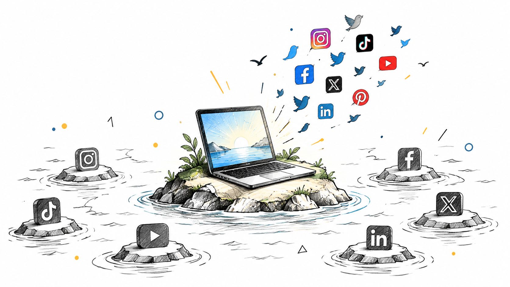
The stronger approach treats your site as the owned hub for your professional identity. Social platforms can help you distribute ideas, but your website is where you control the context. You decide which projects appear first, how you explain your methods, and what a visitor should do next.
The logic isn't new. Tim Berners-Lee's first website, info.cern.ch, was published on August 6, 1991, after he created the Web at CERN. It explained the Web project, hypertext, web servers, and how people could create their own pages. The site was a compact information hub, not a decorative marketing experience. You can find the history in the World Wide Web project record from W3C.
Build an asset, not another profile
That early model still works. State who you are, explain what you do, provide evidence, and connect visitors to useful resources. The Web became publicly available when CERN placed the Web software in the public domain on April 30, 1993, helping turn website publishing into a broadly accessible practice, as CERN's account of the Web's origins explains.
The Web then became crowded quickly. Historical estimates cited by NPR and recorded in the W3C history show approximately 10 websites in 1992, 3,000 in 1994, and 2 million by 1996. That progression explains why having a website alone isn't enough. Your site needs a clear position and a useful reason to exist.
For an ecommerce founder, that might mean publishing lessons from product launches, merchandising decisions, retention experiments, or operational mistakes. For a marketer, it could mean detailed campaign breakdowns, channel analysis, and opinions grounded in work you've done.
Practical rule: Every important page should answer two questions quickly: “Why should I trust this person?” and “What can I do next?”
Your presentation matters, but it shouldn't become a substitute for evidence. Use a professional portrait that feels consistent with your role. If you need polished visual assets, you can explore resources to create personal brand headshots, then pair the image with a concise value proposition rather than a generic greeting.
The result is more durable than a social profile. A domain, a well-organized content structure, and a growing library of useful pages can continue attracting people while algorithms and platforms change.
Choosing Your Platform Without Getting Trapped
The right platform depends on what your site needs to become. A designer displaying selected work has different requirements from a founder who wants to sell a product, grow an email list, publish SEO content, and automate follow-up.
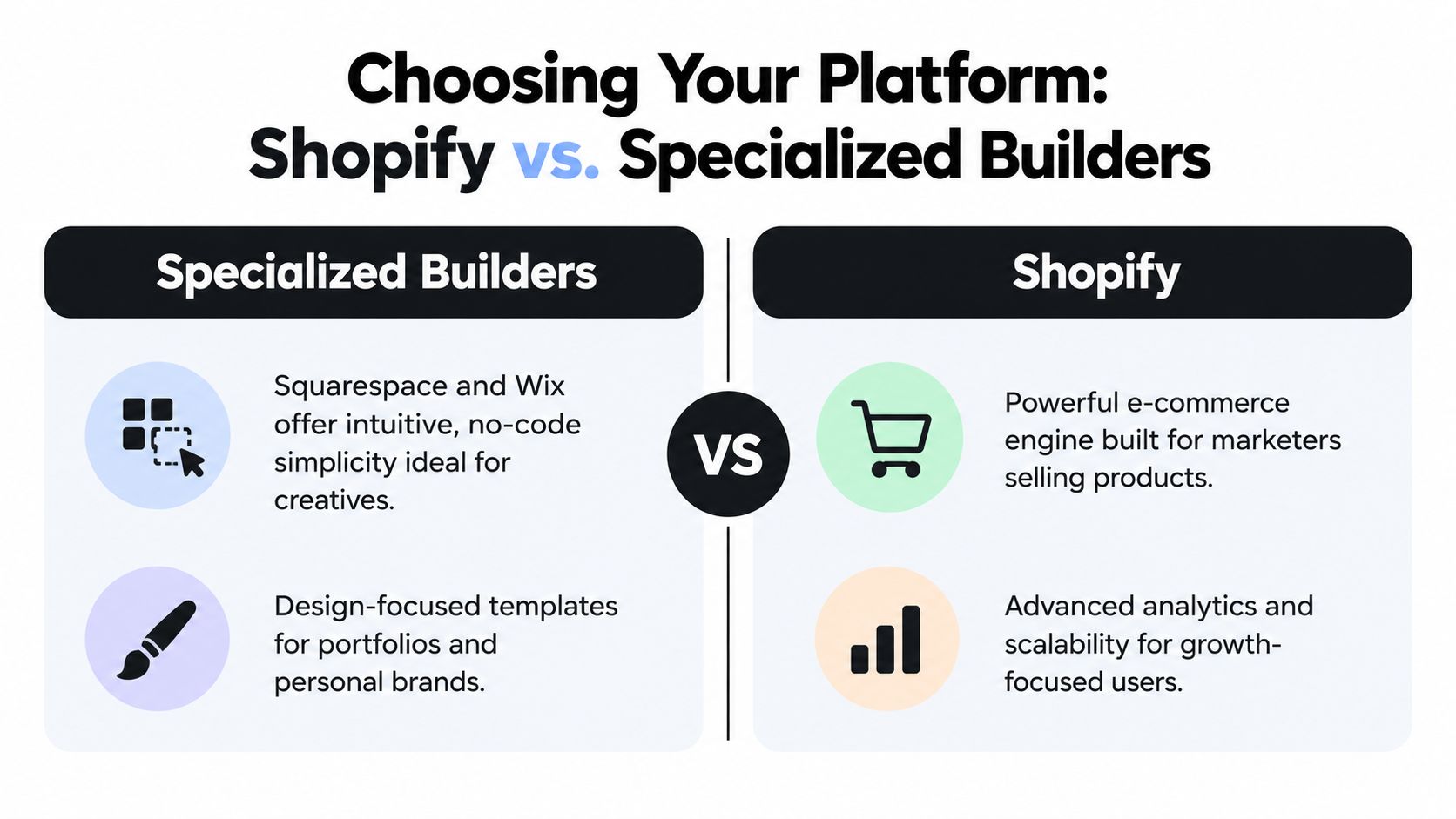
Specialized builders such as Squarespace and Wix usually win on speed and simplicity. Their templates are easy to adapt, hosting is managed, and a nontechnical user can assemble a polished portfolio without touching code. That's a sensible choice when your site has a narrow purpose, limited functionality, and no expectation of becoming a commerce or content engine.
Specialized builders versus Shopify
| Priority | Specialized builder | Shopify |
|---|---|---|
| Initial setup | Fast, visual, and template-led | More configuration, especially for a content-first site |
| Portfolio presentation | Strong default experience | Flexible, but often needs more deliberate theme work |
| Selling products | Available through integrations or plan features | Native commerce foundation |
| Content and automation | Suitable for straightforward publishing | Better fit when content connects to products, audiences, and workflows |
| Long-term direction | Efficient for a focused personal presence | Useful when the site may become a commercial ecosystem |
Shopify is often underused for personal websites because people associate it only with storefronts. For ecommerce founders and marketers, that commerce foundation can be an advantage. You can connect personal essays to product launches, create landing pages for digital resources, collect subscribers, and keep customer-facing activity within infrastructure you already understand.
The trade-off is complexity. Shopify can encourage you to install too many apps, add unnecessary sales elements, or force a store-like structure onto a site that should feel personal. Start with a lean theme, remove visual clutter, and keep the primary navigation focused on your expertise.
For a broader comparison of commerce platforms and their strategic differences, review this guide to ecommerce platforms and Shopify. If you're deciding between WordPress and hosted builders, a practical guide to create a performing WordPress blog can help you evaluate the publishing side separately.
Choose for the next version of the business
A pure portfolio rarely needs the same infrastructure as a founder's publishing and sales system. Choose a specialized builder if you value fast setup and don't expect to sell, automate, or expand the site's role. Choose Shopify when products, lead capture, content, and customer journeys need to work together.
For Shopify merchants managing visual assets across a catalog, PROMPTit AI Bulk Images Editor for Shopify provides image upscaling, graphic-element removal, image enhancement, background processing, and lifestyle image generation powered by the Google Gemini Nano Banana Pro model. It's relevant when product visuals appear both in a store and in personal-brand content, but it shouldn't replace thoughtful art direction or accurate product representation.
Structuring Content That Builds Trust and Converts
Your homepage has one job: help the right visitor understand your value and choose a next step. It doesn't need to contain your entire professional history.
Lead with a specific positioning statement. “I help ecommerce teams improve growth” is broad. “I help Shopify brands turn product and customer data into clearer acquisition and retention decisions” gives a visitor a better reason to continue.
Give every page a commercial purpose
Use the site architecture to move from context to evidence to action.
- Homepage: State who you help, what you do, and which action matters most. That action might be reading a case study, joining a newsletter, booking a conversation, or viewing a product.
- About page: Explain your operating experience and principles. Don't write a chronological autobiography unless the chronology helps visitors understand your expertise.
- Case studies: Show the problem, your role, the decision process, the work delivered, and the outcome. Protect confidential information by describing the situation accurately without inventing results.
- Resources or blog: Publish material that answers questions your ideal clients already ask. Personal experience makes these pages more credible than generic summaries.
- Contact page: Make the route obvious. A short form with a useful prompt is usually better than forcing visitors to search for an email address.
The strongest portfolio pages behave like sales pages without sounding like advertisements. They help a prospect imagine working with you because they reveal how you think, not only what you've finished.
A project becomes persuasive when the visitor can see the decision behind the deliverable.
That principle also applies to ecommerce. If you sell a product, connect it to your expertise and point of view. A founder might publish the sourcing decisions behind a collection, while a marketer might sell a workshop or digital resource that extends a published framework. The product should feel like a logical next step, not an unrelated promotion inserted into a biography.
Make the path obvious
Review your site as if you arrived from a search result rather than the homepage. Does the article explain who wrote it? Does the case study link to a relevant service? Does the contact page tell a qualified visitor what information to include?
Small structural improvements often matter more than visual effects. A focused navigation menu, descriptive buttons, related-content links, and a consistent contact path give visitors confidence. For more detailed guidance on turning pages into clearer action paths, use this resource on landing page optimization.
SEO and AI-Ready Content Strategies
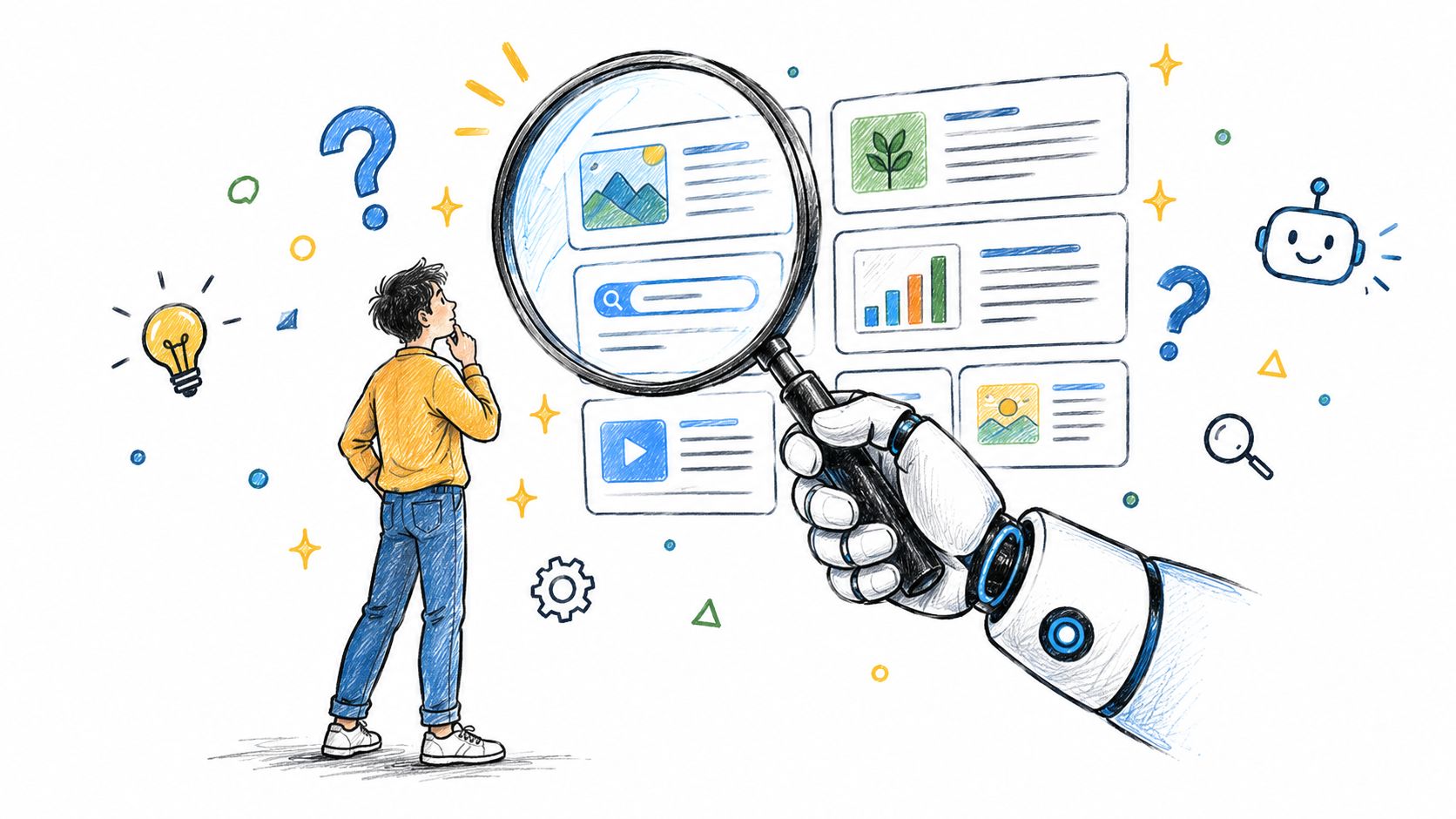
Search visibility starts with clarity, not keyword repetition. Search engines and answer systems need to understand who authored a page, what topic it covers, and why the information deserves attention.
That requires a combination of conventional SEO and first-hand substance. Use descriptive page titles, logical headings, internal links, clean URLs, structured data where appropriate, and text that directly answers a searcher's question. Then add the element generic content can't copy easily, your experience making decisions in real commercial situations.
Publish for discovery and direct relationships
AI-generated answers have changed the relationship between visibility and clicks. Ahrefs found that average traffic from AI sources grew roughly tenfold over the year studied, but AI traffic still represented only 0.25% of total traffic on average, while Google represented 39.35%. Those figures appear in the Ahrefs analysis of AI traffic growth.
The practical conclusion isn't to abandon traditional SEO or chase every new AI tactic. Build pages that can be understood, cited, and acted upon. A concise answer may earn visibility in an answer interface, while a deeper explanation, downloadable resource, newsletter, or consultation gives the visitor a reason to continue to your site.
Use a clear author name and biography. Explain your role in the work. Separate your observations from claims about the wider market. Link to relevant evidence when you make a factual assertion, and update pages when the underlying information changes.
Make experience easy to extract
A useful article usually has a recognizable shape:
- Answer the core question early. Don't hide the useful point beneath a long introduction.
- Add decision criteria. Explain when one approach works and when it creates problems.
- Show the operating detail. Include the workflow, constraints, tools, and trade-offs you encountered.
- Create a next step. Link to a related service, case study, subscription, product, or contact path.
Long-tail research helps you discover the language people use when their problem becomes specific. This guide to long-tail keyword research can support that process, but don't let keyword lists dictate your point of view.
Your personal site should make your expertise legible to machines and valuable to people. Write precise answers, support important claims, and keep your own experience visible throughout the page.
Pre-Launch Checklist for Performance and Accessibility
A site can look excellent in a design review and still fail on a phone, with a keyboard, or through a screen reader. Test the experience before launch, not after a visitor reports a problem.
Set a performance budget for mobile templates. The recommended Core Web Vitals targets are Largest Contentful Paint below 2.5 seconds, Interaction to Next Paint below 200 milliseconds, and Cumulative Layout Shift below 0.1, as outlined in this website performance methodology.
Test the page before you polish it
Start with the page visitors will use most, usually the homepage, a project page, and the contact form.
- Compress the visual payload: Serve responsive WebP or AVIF images, define image dimensions, and preload only the primary hero asset.
- Reduce execution work: Defer nonessential JavaScript, remove unused CSS, and limit font variants.
- Reserve dynamic space: Give embeds, forms, and widgets fixed space so they don't push content around after loading.
- Test realistic conditions: Use throttled mobile testing as well as real-user monitoring. Desktop results won't reveal every device or network problem.
Avoid autoplay video backgrounds, oversized hero images, synchronously loaded third-party scripts, and late-loading fonts that move buttons or headlines. For an ecommerce founder, this matters especially on project pages and contact interactions, where visual credibility and response speed meet.
Make accessibility part of the build
WebAIM's 2025 audit of one million homepages detected WCAG failures on 94.8% of pages. Low-contrast text affected 79.1%, missing image alternative text affected 55.5%, and missing form labels affected 48.2%, according to the WebAIM Million 2025 findings.
You don't need advanced technical expertise to address the basics. Use one descriptive <h1>, keep headings in logical order, identify <nav> and <main> landmarks, write descriptive link text, and add explicit labels to form fields. Informative images need useful alternative text, while decorative images should not create noise for assistive technology.
Run WAVE or axe during development, then test manually:
- Keyboard navigation: Move through menus, links, forms, and dialogs without a mouse.
- Focus visibility: Confirm that the active element is always obvious.
- Zoom and contrast: Enlarge text and verify that content remains usable.
- Screen-reader flow: Check whether headings, labels, errors, and form instructions make sense when announced.
Automated tools catch patterns. They can't reliably judge whether your alt text is useful or whether the focus order reflects the task. Human review remains essential.
Launch, Maintain, and Automate for Growth
Publishing your site is the beginning of its useful life. A static site loses relevance when your role changes, projects finish, links break, and the content no longer reflects the questions your audience asks.
Keep a lightweight operating routine. Review analytics to identify which pages attract qualified visitors, which links receive attention, and where people leave. Update the pages that influence trust first, especially your homepage, case studies, contact flow, and highest-value articles.
Automate the repeatable work
Automation should remove administration, not replace judgment. Schedule distribution for new articles, send a clear confirmation after contact-form submissions, and create reminders to review important pages. A LinkedIn post scheduler can help turn finished articles into a consistent distribution workflow, but you should still adapt the message to the audience and platform.
For Shopify-based sites, connect content and commerce carefully. A product launch might begin with an educational article, move to a focused landing page, and end with a measurable purchase or subscription action. Keep the chain understandable so you can tell whether the content attracted attention, built trust, or generated a commercial response.
Maintenance rule: Automate publishing tasks, but keep positioning, claims, and customer promises under human review.
Review your analytics and search queries before deciding what to publish next. Refresh pages when your process changes, add internal links when new resources appear, and remove content that no longer serves your audience. Small, consistent improvements turn a personal website from a neglected profile into a durable discovery and conversion engine.
Yassine Malti builds SEO-focused Shopify apps and custom automations for merchants who want to improve traffic, streamline operations, and create more effective customer journeys. Visit Yassine Malti to explore practical SEO insights, Shopify tools, and bespoke solutions for building a faster, more scalable ecommerce presence.
Shopify apps by Yassine Malti
Put this into practice
-

PROMPTit · AI photo editing
Five AI image tools for your product photos · 5 images/month free
-

ALT SEO · Image alt text
AI alt text for every product image · 100 images/month free
-

RANKit · Meta titles & descriptions
AI meta titles and descriptions, sized for Google · 50 meta tags/month free