Your header looks fine. Six links, even spacing, a hover underline that slides in, and it matches the mockup. Then you tab into it and the picture changes. The focus ring is gone because the theme reset set outline: none on every anchor. The Sale dropdown never opens because it's hover only. Two skip links sit at the top of the page doing the same job, so keyboard users press Tab twice for no reason.
Most tutorials stop at the flex row. A horizontal HTML menu isn't a row of styled links. It's a navigation system: a landmark, a list, real destinations, a keyboard path through every one of them, and a way to skip the whole thing. Baymard Institute reported in 2024 that 76% of websites had mediocre-to-poor homepage and category-navigation performance, according to its year in review, and almost none of that gap is visual.
What follows is the build order I use on storefronts: markup first, layout second, dropdowns third, then the checks that catch what the eye misses. The Shopify specifics come last, because that's where themes and apps collide.
Table of Contents
- Build a Horizontal Menu in HTML and CSS
- Responsive Breakpoints for Horizontal Menus
- Dropdowns and Keyboard Rules That Hold Up
- Test Focus, Layout and Performance Before Launch
- Ship the Menu in Your Shopify Theme
Build a Horizontal Menu in HTML and CSS
A horizontal HTML menu is a row of real links inside a nav landmark. No divs with click handlers, no spans styled to look clickable, no image map. Built this way it works with JavaScript switched off, announces itself as navigation, and every item is reachable with the Tab key.
Adoption is broad but incomplete. The HTTP Archive Web Almanac reported that 71% of pages used the semantic HTML nav landmark in 2025, up from 66% in 2021. The other 29% is where keyboard users come unstuck.
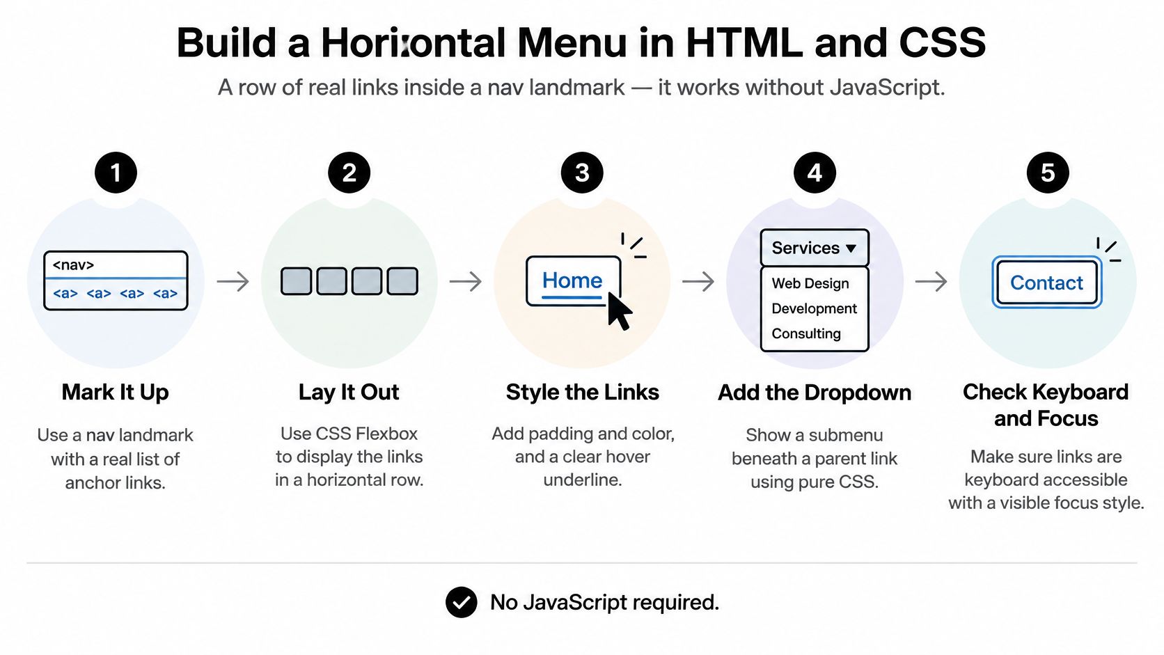
Step 1. Wrap the list in a nav landmark. <nav aria-label="Main"> gives screen reader users a region they can jump straight to, and the label is what they hear in their landmark list, so "Main" beats a vague second "Navigation".
Step 2. Write a plain ul with one li per top-level link. Screen readers announce "list, 3 items", and people instantly know how much is in front of them. A row of anchors inside divs announces nothing, so users hear an unrelated run of links with no shape.
Step 3. Label each anchor with its destination. "Men's shoes" tells you where you'll land. "Shop now" doesn't. The Web Content Accessibility Guidelines 2.2 asks authors to give users ways to move around, find content, and determine where they are, and a descriptive label does all three at once.
Step 4. Make the skip link the first focusable element. It points at #main, the id on your content wrapper. One Tab, one Enter, and a keyboard user lands past the menu instead of walking through it on every page.
Step 5. Style with flex, wrap the row, and never delete the focus ring. display: flex with flex-wrap: wrap gives you the horizontal bar plus a graceful fallback when the viewport narrows. A :focus-visible outline of 3px or more in a colour that contrasts with the header background is the piece people destroy by accident when they paste in a CSS reset.
The markup those steps produce, in order:
<a class="skip-link" href="#main">Skip to content</a>

<nav aria-label="Main">
  <ul class="menu">
    <li><a href="/en/collections/mens-shoes/">Men's shoes</a></li>
    <li><a href="/en/collections/womens-shoes/">Women's shoes</a></li>
    <li><a href="/en/collections/sale/">Sale</a></li>
  </ul>
</nav>

<main id="main">…</main>
And the CSS that turns it into a row without breaking any of it:
.skip-link {
  position: absolute;
  left: -9999px;
}
.skip-link:focus {
  left: 1rem;
  top: 1rem;
  background: #fff;
  padding: 0.5rem 1rem;
  z-index: 100;
}

.menu {
  display: flex;
  flex-wrap: wrap;
  gap: 1.5rem;
  list-style: none;
  margin: 0;
  padding: 0;
}

.menu a {
  display: inline-block;
  padding: 0.75rem 0.25rem;
  color: #111;
  text-decoration: none;
}

.menu a:hover {
  text-decoration: underline;
}

.menu a:focus-visible {
  outline: 3px solid #0b5fff;
  outline-offset: 2px;
}
The slip that undoes all of this is the div row. Six clicks handlers, six cursor: pointer rules, and a screen reader receives six loose links with no list and no count. It looks identical on screen, which is exactly why it survives review.
Practical rule: if you can't reach it with Tab, it isn't a link. It's decoration with a cursor attached.
When the build is right, resizing the window to 400px leaves the same links wrapping onto a second line, nothing clipped, and tabbing from the address bar reveals the skip link first, then each item inside a clearly visible ring. That's the whole test, and it takes thirty seconds.
Responsive Breakpoints for Horizontal Menus
A horizontal row earns its space on desktop. Below that width, it either folds behind a toggle or slides sideways, and whichever you pick changes what you have to test at that size. The row itself is not a mobile pattern. Six links of eleven characters each need roughly 700px of comfortable width once padding and gaps are counted, so anything under 900px is a compromise you're choosing on purpose.
| Breakpoint | Layout | Menu behaviour | Notes |
|---|---|---|---|
| 320px to 599px | Vertical list | Toggle button reveals the links, state carried by aria-expanded |
Tap targets at least 44 by 44 CSS pixels |
| 600px to 899px | Wrapping row | Links wrap onto a second line, no dropdowns yet | Nothing clipped, nothing hidden behind overflow |
| 900px and up | Single flex row | Full bar with disclosure dropdowns | Every item visible without scrolling |
Two Small-Screen Patterns That Hold
A toggle with aria-expanded. One button labelled "Menu", aria-controls pointing at the list, and aria-expanded="false" that flips to true on activation. The links stay in the document as a vertical list, which means they work if the script fails, and screen readers get the same list they'd get on desktop.
A scrolling strip. On the ul, set overflow-x: auto, scroll-snap-type: x mandatory, and scroll-padding-inline: 1rem, so a link focused at the edge scrolls fully into view instead of sitting half under the frame. Add -webkit-overflow-scrolling habits from older iOS out of your head; modern Safari handles momentum natively.
The desktop rule itself is three lines, and it should live in the same stylesheet as the layout rather than in a theme's inline block:
@media (min-width: 900px) {
  .menu { display: flex; }
}
On touch layouts, 44 by 44 CSS pixels is the floor for any tappable item. A 28px pill with 6px padding misses it, and the miss is invisible until someone on a bus taps "Sale" and hits "New in" instead.
The failure that breaks most scrolling strips is a six-item row that overflows the viewport with no cue that more exists. The last link isn't there as far as the user is concerned. Fix it with a fading gradient on the right edge, either a pseudo-element with linear-gradient(to right, transparent, #fff) or a mask-image on the container, so the cut-off item looks deliberately continued rather than truncated. If you want the animated version of these mechanics, the CSS slider menu patterns use the same overflow and snap rules.
Run one check before you move on: drag the browser from 320px to 1280px and count visible items at each band. If the count jumps at a point you didn't plan for, your breakpoint is in the wrong place.
Dropdowns and Keyboard Rules That Hold Up
A dropdown needs JavaScript only when it must open on click or tap. Hover-only submenus fail two audiences at once: keyboard users can't trigger them, and touch users have no hover to give. Everything else is a disclosure pattern you can ship in about forty lines.
Here's the structure, then the five moves that make it safe.
<li class="has-sub">
  <a href="/en/collections/shoes/">Shoes</a>
  <button type="button" aria-expanded="false" aria-controls="sub-shoes">
    <span class="visually-hidden">Show Shoes submenu</span>
  </button>
  <ul id="sub-shoes" class="submenu" hidden>
    <li><a href="/en/collections/boots/">Boots</a></li>
    <li><a href="/en/collections/sneakers/">Sneakers</a></li>
  </ul>
</li>
- Give the parent a button, not a hover target.
aria-expanded="false"plusaria-controlsties the control to the panel in the accessibility tree, so the relationship is explicit rather than implied by proximity. - Mark the submenu with the
hiddenattribute. This is the part people skip.hiddenremoves the links from the tab order when closed, so a keyboard user doesn't tab into an invisible list and lose their place on the page. - Flip
aria-expandedandhiddenin the same handler. Set them together, in one function. Diverging state, where the panel is visible but reports collapsed, is worse than no ARIA at all. - Close on Escape and on focus leaving the group. A
focusoutlistener that readsevent.relatedTargetand closes when it falls outside the list item handles both mouse and keyboard exits without extra listeners ondocument. - Keep the parent link pointing at a real page. JavaScript off should leave a working link to the category, with the submenu never opening. That fallback is what makes the pattern progressive rather than dependent.
Why role=menu Breaks a Storefront
The temptation is to reach for role="menu" and role="menuitem" because the words match. They don't mean what you think. The WAI-ARIA Authoring Practices Guide menubar pattern describes an application-style command bar: focus moves between top-level items with Left and Right Arrow, Down Arrow opens a submenu, Escape exits it, and Tab is not the primary way through the items. Announce that contract to a screen reader and the user will press Down Arrow expecting a submenu. Your site navigation gives them nothing.
The numbers back the caution. In 2025, 4.5% of the top 1,000,000 home pages used an ARIA menu with role="menu", and 35% of those ARIA menus introduced accessibility barriers, according to WebAIM's Million study. More than a third of the sites that opted in created a problem.
The disclosure button avoids all of it, because the expected behaviour is the one users already have:
| Key | Top-level bar | Open submenu |
|---|---|---|
| Tab | Moves to the next link or menu button | Moves through submenu links, then leaves the menu |
| Enter or Space | Activates a link or opens a submenu button | Activates the focused link |
| Down Arrow | Opens the submenu and focuses its first link | Moves to the next submenu link |
| Up Arrow | Moves focus to the last item in an open submenu | Moves to the previous submenu link |
| Escape | Closes any open submenu | Closes the submenu and returns focus to its button |
Read that table against both the closed bar and an open panel. Every row needs to hold in both states, and Escape must return focus to the button that opened the panel rather than dropping it to the top of the document.
A disclosure button tells the user what it does and then does it.
role="menu"tells the user something else entirely, then asks them to guess.
The attribute audit takes two minutes and catches most of what's left. aria-current="page" belongs on the current page's link and nowhere else, one per page. aria-haspopup goes only on buttons that open a menu, not sprinkled across links. No aria-hidden="true" on anything visible, no role="presentation" on the ul unless you've tested what the list semantics were doing for you. Then Tab through the page with the submenu closed and confirm no link inside it ever receives focus.
Test Focus, Layout and Performance Before Launch
Testing this is a routine, not a judgement call. Five checks, run in order, and a menu either passes all of them or it doesn't ship.
- Turn JavaScript off and click every top-level and submenu link. Each one should load its page. A dropdown that only exists after hydration has already failed a share of your traffic.
- Tab from the address bar and watch the sequence: skip link first, then each menu item inside a visible focus ring, then the page content. If focus disappears at any point, an element is receiving focus while hidden.
- Press Escape and Shift+Tab from inside an open submenu. Focus should return to the button that opened it, and the page should never trap the user in a loop they can't exit with Tab.
- Check 320px, 768px and 1280px and count visible items at each width against the breakpoints table. A count that surprises you means a breakpoint is misplaced.
- Run Lighthouse and axe DevTools and record every finding in the ticket, including the ones you plan to ignore. Ignoring a known violation is a decision; not knowing about it is a bug.
Performance is the easy part on a six-link menu. Skip the library. Keep the menu CSS under about 10KB, load any dropdown script with defer, and reserve the bar's height with a fixed min-height so the header doesn't jump when the webfont swaps in.
The Duplicate Skip Link Problem
Say a theme's header snippet outputs a skip link and a review app injects its own into the same header. Both point at #main. Keyboard users now get two Tab stops that do the same thing, and the second one reads as a stutter. The fix is to delete the duplicate from the theme's header snippet, keep whichever one appears first in the DOM, and retest. It's a five-minute change that only shows up when you tab through with the apps active.
A menu tells people where they can go. Breadcrumb navigation for SEO tells them where they are, and the two get audited together because they fail together.
Paste this into the launch ticket: skip link appears first, pass or fail. Focus ring visible on every item, pass or fail. Closed submenu keeps its links out of the tab order, pass or fail. Escape returns focus, pass or fail. No horizontal overflow at 320px, pass or fail.
Ship the Menu in Your Shopify Theme
Shopify gives you the menu data and the render pipeline, so the work is wiring them together without letting an app break it later.
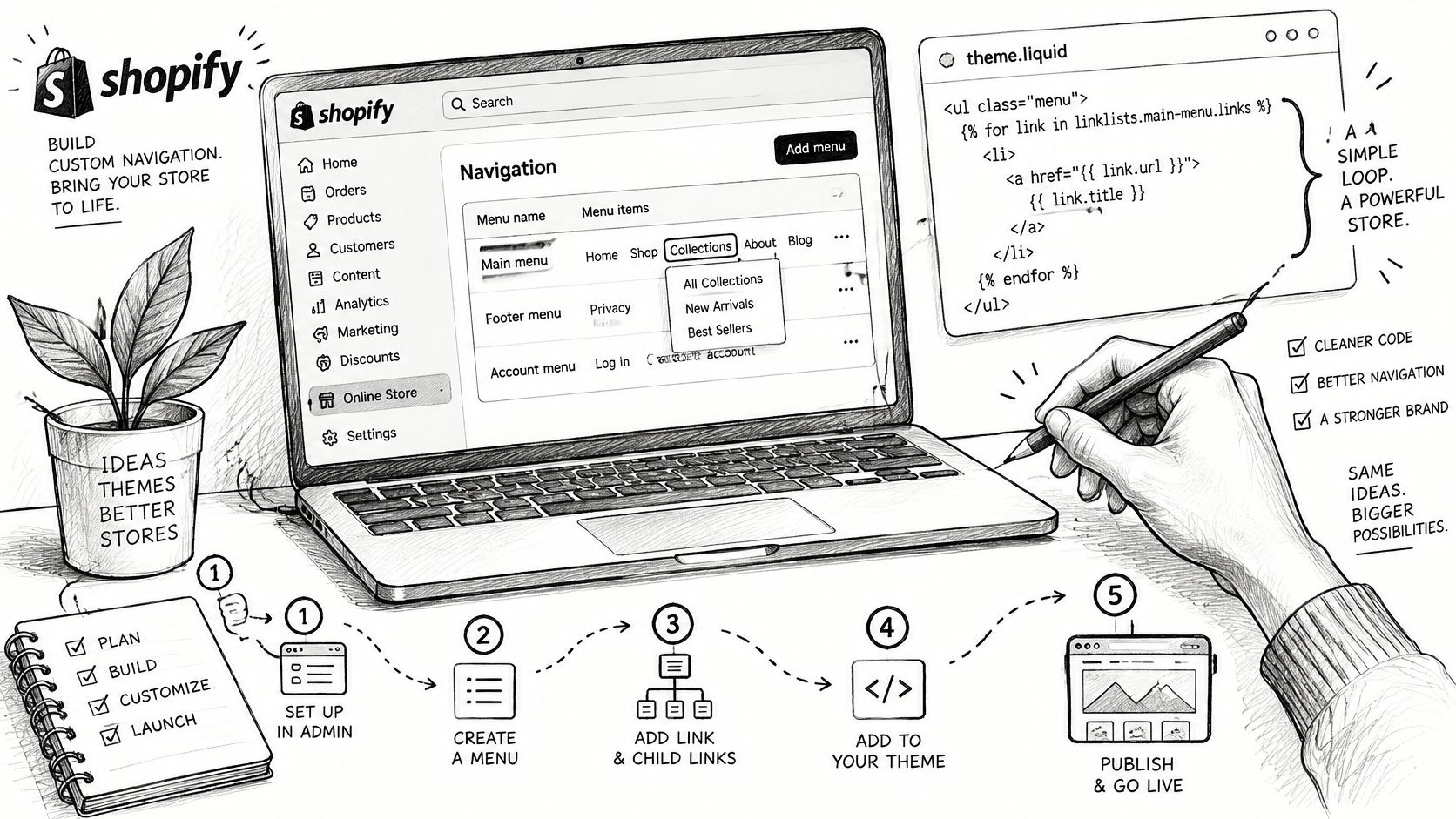
Open Navigation in the admin and build under the main-menu handle. Child links become your dropdowns, because the snippet loops over that handle and nothing else. Drag the items into the order you want them read aloud; the admin order is the DOM order.
Create snippets/header-menu.liquid with a nav element carrying aria-label="Main". A theme that renders the menu as a bare div loses the landmark, and the fix costs you six characters in a file you control.
Loop over the links and output an anchor for each one. The handle is the contract:
{%- if linklists['main-menu'].links.size > 0 -%}
<nav aria-label="Main">
  <ul class="menu">
    {%- for link in linklists['main-menu'].links -%}
      <li>
        <a href="{{ link.url }}"{% if link.active %} aria-current="page"{% endif %}>{{ link.title }}</a>
        {%- if link.child_links.size > 0 -%}
          <ul class="submenu">
            {%- for child in link.child_links -%}
              <li><a href="{{ child.url }}">{{ child.title }}</a></li>
            {%- endfor -%}
          </ul>
        {%- endif -%}
      </li>
    {%- endfor -%}
  </ul>
</nav>
{%- endif -%}
Here's the video walkthrough if you'd rather follow the build in motion:
Guard the child list with size > 0. Rendering an empty <ul> for every parent without children puts phantom lists in the accessibility tree and empty boxes in the layout. The condition is one line and prevents both.
Render the snippet from the header section with {% render 'header-menu' %}. If you're also adjusting the surrounding header and footer markup, these notes on styling the CSS header and footer cover the stacking and spacing that the menu inherits.
Then the app check. Announcement bars, review widgets and chat apps inject markup into the header, and a second skip link or a duplicate nav landmark is the usual result. Keep exactly one of each per page.
Product thumbnails inside the menu need real alt text, not mens-boot-final-v2.jpg. Our ALT SEO app generates AI alt text for every product image, and it includes 100 images per month free, which covers most small catalogues without a payment. Before publishing, copy the snippet into a duplicate theme, run the routine from the testing section against it, and only then hit publish.
Yassine Malti builds Shopify apps and custom automations that take over the repetitive parts of running a storefront, from bulk meta and alt text work to workflow automation. If this guide got your menu passing every keyboard check, the next weak point is usually a catalogue full of images with file-name alt text, and that's a fix you can automate in an afternoon. Visit Yassine Malti to see the ready-made apps and the blog notes on navigation, headers and on-page SEO.
Shopify apps by Yassine Malti
Put this into practice
-

ALT SEO · Image alt text
AI alt text for every product image · 100 images/month free
-

RANKit · Meta titles & descriptions
AI meta titles and descriptions, sized for Google · 50 meta tags/month free
-

TAGit · Product tags
SEO-friendly product tags, generated in bulk · 50 tags/month free