
Heavy ecommerce home pages can carry dozens of images and several megabytes of image payload. That reality turns Shopify resizing images into bandwidth control, not cosmetic tidying. A card that renders at a few hundred pixels should never force a shopper to download a full camera file.
I recommend starting from the rendered box. Measure how wide the image displays on desktop and mobile, allow around 2x for retina density, then upload one clean master and let the Shopify CDN generate the smaller variants. Shoppers see sharp images. They download far less.
Table of Contents
- Recommended Shopify Image Sizes at a Glance
- Choose a Tool for Resizing and Bulk Image Work
- How to Prepare and Upload Originals in Shopify
- How to Render Responsive Images with Liquid
- Fix Blurry, Cropped or Slow Shopify Images
- Test Speed and Roll Out Shopify Image Sizes
Recommended Shopify Image Sizes at a Glance
Use this table to choose a master size before you upload anything. The pattern is consistent: keep the source large enough for the biggest use of that image, then let the theme request smaller versions for cards, thumbnails, and phones.
Recommended image sizes by Shopify placement
| Placement | Rendered width | Upload source | Notes |
|---|---|---|---|
| Product gallery main image | 800-1000 px wide | 2048 x 2048 px square | Largest product size; Shopify generates smaller variants |
| Product card in collection grid | 300-400 px wide | 800 x 800 px square | Keep one aspect ratio across all products |
| Product thumbnails | 100-150 px wide | 400 x 400 px square | Small enough for mobile thumbnail strips |
| Collection image | 600-800 px wide | 1200 x 1200 px | Use one ratio for every collection |
| Homepage hero banner, desktop | Full width, up to 1600 px | 2048 px wide, 16:9 | Set a focal point and keep text clear of the crop |
| Homepage hero banner, mobile | 400-800 px wide | 1600 px wide portrait crop | Use a separate portrait crop for small screens |
| Blog featured image | 800 px wide | 1600 x 900 px | 16:9 avoids heavy cropping in article layouts |
| Logo | 200-300 px wide | 600 px wide PNG or SVG | Transparent background keeps it clean on any header |
The rule behind each row is about twice the rendered width. A product card shown at 400 px needs roughly an 800 px source to stay sharp on a 2x retina display. Going far beyond twice the width adds download weight without adding visible detail in that placement.
A square 2048 x 2048 px product master covers almost every gallery, card, and thumbnail use, and it leaves Shopify room to generate smaller variants. Shopify's product media documentation states that product and collection images can be uploaded at up to 5,000 x 5,000 pixels, equivalent to 25 megapixels, current as of 2026. That ceiling isn't a target, and a bigger file isn't a better file.
Measure the real placement
Open your live theme, right-click an image, and inspect it at desktop and mobile widths. Read the displayed CSS size, not the natural size. If the box is 400 px wide and the browser downloaded a 2048 px file for that spot, you've found wasted bandwidth.
Practical rule: Size from what shoppers actually see, then multiply by two for retina. Don't size from your camera roll.
Check a product page, a collection grid, and the homepage hero this way before you change anything. Those three placements usually explain most of your image weight and most of your blurriness.
Choose a Tool for Resizing and Bulk Image Work
Judge tools on crop control, bulk volume, AI enhancement, learning time, and how easy it is to undo a change. No single approach wins every job, and using the wrong one creates work you have to redo.
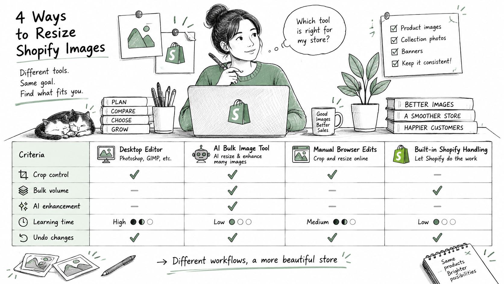
Image resizing approaches compared
| Approach | Best for | Handles | Limit |
|---|---|---|---|
| Desktop editor such as Photoshop, GIMP or Photopea | Hand-cropping hero and key product shots | Crop, ratio and export | Manual, slow for hundreds of products |
| Batch compressor such as Squoosh or TinyPNG | Shrinking file weight before upload | Compression and WebP conversion | Limited crop and focal control |
| Shopify CDN through Liquid | Theme-rendered sizes on every page | Responsive variants generated on request | Can't enlarge images; needs theme code |
| Bulk image app such as PROMPTit (built by the author of this guide) | Upscaling, cleanup and backgrounds across a catalog | Bulk AI enhancement and processing | Review AI output before publishing |
A desktop editor is right for the hero and your best sellers, where the crop sells the product. A compressor is right before upload, when dimensions are already correct. If you're working with ordinary JPEGs outside Shopify, this guide on how to resize a JPEG image cleanly covers export choices that pair well with Squoosh or TinyPNG.
The Shopify CDN through Liquid does the everyday rendering work, but it has a hard limit: it can't invent pixels that aren't in your source. A bulk app fits catalog-wide cleanup. PROMPTit AI Bulk Images Editor for Shopify, built by Yassine Malti, the author of this guide, includes Image Upscaler, Magic Eraser for unwanted text and watermarks, Image Enhancer for sharpening, and Background Processor for consistent backgrounds, powered by Google Gemini Nano Banana Pro.
Whatever you pick, you set the scope: which products, collections or images to process, which fields to update, and whether existing values can be overwritten. Apps change a store only within that scope.
Review AI output before publishing, especially hands, labels, and product edges. Bulk speed doesn't remove the need for a visual check on a sample first.
My split is manual editing for the hero, Liquid for theme rendering, and a bulk tool only where the catalog is too inconsistent to fix by hand.
How to Prepare and Upload Originals in Shopify
Quality starts with the largest original you own, kept untouched. Every resize should be a derivative of that master, never a resized copy of an already compressed copy.
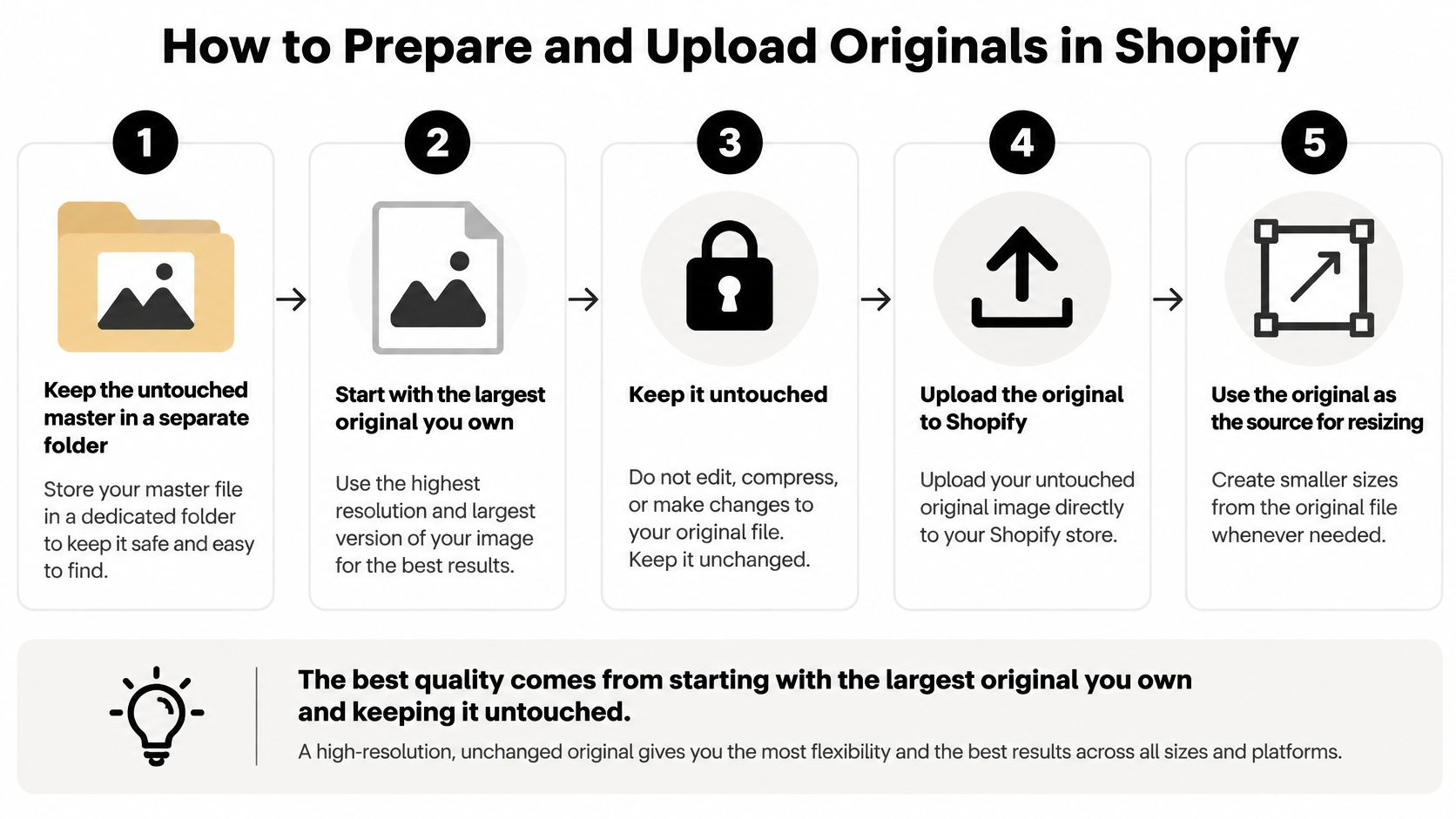
The upload process
- Keep the master separate: Store the untouched original in its own folder and work only from copies. The common slip is overwriting the only full-resolution file with a small export.
- Crop to the placement ratio first: Use square for products and cards, 16:9 for blog features, and leave breathing room around the product. Cropping after export throws away pixels you've already paid to compress.
- Resize the long edge to 2048 px for products: This handles the largest gallery view without carrying camera-sized weight. Don't resize a small file upward and expect sharpness.
- Export photos as sRGB JPEG at quality 80-85: Use PNG or WebP only where transparency matters, and strip metadata. A photo saved as PNG can be several times heavier than its JPEG equivalent with no visible gain.
- Rename with descriptive product words: Avoid endings such as medium, large, or thumb, because Shopify can misread them as transformation suffixes. A clean name also helps you find the file later.
- Upload in the right place: Put theme images through Content and Files, and product photos through product media. Shopify's file-upload documentation sets the maximum image file size at 20 MB, documented in 2026.
- Add alt text and set a focal point: Write descriptive alt text before publishing, and set the focal point so later ratio changes keep the subject in frame. If you want that text to earn search visibility too, learn how to optimize alt attributes for image search rather than repeating the product title.
What a clean upload looks like
In the admin, the preview should show the correct ratio, with no soft edges or compression artifacts at 100% zoom. If it looks tired there, no theme setting will rescue it.
For stores that also need product metadata at scale, RANKit AI Meta Tags Generator for Shopify generates meta tags from product images, titles, and descriptions, including bulk processing and multi-language support. Keep that separate from image preparation: fix the master first, then worry about tags.
How to Render Responsive Images with Liquid
Manual exports alone don't solve Shopify resizing images at runtime, because the same product image appears in a gallery, a card, and a thumbnail strip. The theme has to ask Shopify for the right size in each spot.
The illustration below shows the split between one uploaded master and the different sizes browsers request.
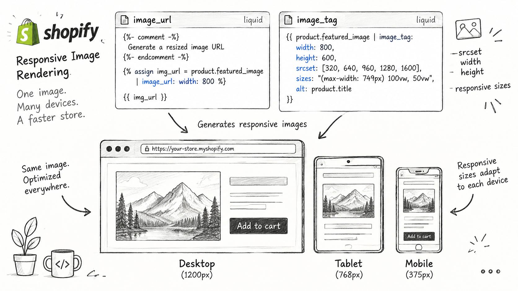
The pattern to adapt
Use image_url to set the width Shopify generates, and image_tag to build the responsive markup:
{{ product.featured_image | image_url: width: 800 | image_tag: sizes: '(min-width: 990px) 25vw, 50vw' }}
image_tag builds srcset candidates plus width and height attributes, which reserve space and reduce layout shift. srcset supplies candidates at different widths, while sizes tells the browser how wide the image will appear at each viewport.
Shopify's image size guidance illustrates a responsive layout with breakpoints at 600 px and 1,200 px, where an image can occupy 100% of the viewport on narrow screens, 50% at intermediate widths, or a fixed 400 px region on larger screens. The browser multiplies that layout width by device pixel density and downloads the smallest candidate that covers it.
This short walkthrough shows how those attributes behave in a real browser.
Where responsive rendering breaks
If sizes is missing or inaccurate, the browser may assume the image is 100% of the viewport width and download an oversized source. That's how a small card ends up loading a hero-sized file.
Your
sizesvalue is a claim about your CSS layout. If the claim is wrong, the browser can't choose well, even when yoursrcsetis perfect.
Also, image_url never upscales. Never request a width above your source, and don't lazy load an above-the-fold hero, because you're delaying the image the page needs first.
Five point check
- Store the image in Files or product media: Static theme assets can't receive the same responsive transformations.
- Call
image_urlwith the display width: Match the largest rendered use for that component. - Pass a
sizesvalue that matches the CSS: Use your real breakpoints, not a copied default. - Set lazy loading only below the fold: Keep the hero eager.
- View page source: Confirm several
srcsetwidths appear, not one fixed file.
Fix Blurry, Cropped or Slow Shopify Images
A card rendered at 350 px that downloads a 2048 px file has a markup problem, not an upload problem. Start from the rendered box, then work backward to the request the browser made.
Shopify image symptoms, causes and fixes
| Symptom | Likely cause | Fix |
|---|---|---|
| Blurry on desktop | Undersized master or request wider than source | Upload at 2048 px and never request a width above the source |
| Product cropped in grid | Aspect ratio mismatch | Set a focal point or export a consistent ratio before upload |
| Large download for small display | CSS-only resizing or inaccurate sizes attribute |
Add a sizes value that matches the layout breakpoints |
| Uneven grid card heights | Mixed source ratios across products | Standardize the ratio for every product before uploading |
CSS-only resizing changes how big an image looks. It does not change how many bytes the phone downloads. That is why a page can look correctly sized in the editor while feeling slow on mobile, with network requests two or three times wider than the box they fill.
Shopify's CDN can detect browser support for formats such as WebP and AVIF and transform images without altering the original. It cannot repair a poor master, an unsuitable ratio, or theme markup that does not use srcset correctly. Naming, format choice, and hero loading order follow the same preparation and Liquid rules described earlier, so apply those first and use this table only for diagnosis.
The penalty repeats on every template that uses the broken pattern. Images account for a large share of total mobile page weight, so one oversized hero or one wrong sizes value multiplies across every product and collection that shares the component.
Audit the request, not the file. Open the network panel, compare the downloaded width against the rendered box at 2x density, and check whether the crop follows your focal point. If you want the search side of the same fix, this guide to Shopify image SEO for product photos covers filename and alt text decisions alongside speed.
Test Speed and Roll Out Shopify Image Sizes
Test on templates, not single pages you've polished by hand. A fix that works on one product but fails in the collection grid isn't a rollout, it's an anecdote.
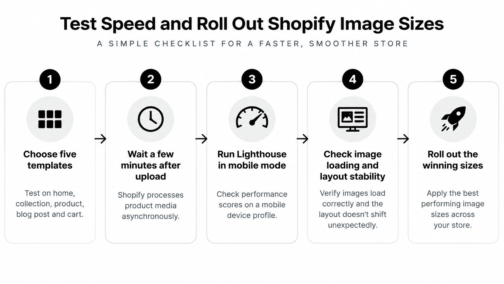
The test sequence
- Choose five templates: Home, collection, product, blog post, and cart. These cover heroes, grids, galleries, editorial images, and small line-item thumbnails.
- Wait a few minutes after upload: Shopify processes product media asynchronously, so testing instantly can mislead you. Then run Lighthouse in mobile mode with throttling and record LCP, CLS, and total transferred image bytes.
- Open the network panel and filter to images: Confirm the browser loaded a candidate close to the rendered width at 2x density. A card rendered at 350 px shouldn't pull a desktop gallery file.
- Check width and height attributes on every image: According to Shopify's CDN performance guidance referencing the 2024 Web Almanac, 66% of mobile pages still contain at least one unsized image. Missing dimensions let the layout jump as images load.
- Fix the LCP image first if it's heavy: Reduce the hero width and keep lazy loading off that image only. Don't trade a faster metric for a visibly soft hero.
- Compare lab numbers with real-user data after a week: Lighthouse is a controlled test, while your shoppers bring slower phones and worse connections. If you need the wider picture, this guide on improving Shopify page speed without hurting SEO helps you separate image weight from other bottlenecks.
Your pass condition is simple: visual quality holds, no oversized candidate loads, and the layout stays stable. If an LCP image sits between 100 and 200 KB for many mobile pages in broad web data, treat that as context, not a universal Shopify target. Your measured Core Web Vitals and how the product looks matter more.
Roll out in one narrow pass
Start with one product. Re-export its master at 2048 px on the long edge, upload it with descriptive alt text, add the Liquid image tag with a sizes value matching your breakpoints, and check srcset in view source. Then run Lighthouse on that product page and one collection page.
Prove the pattern on one product and one collection, then copy the settings. Catalog-wide changes without a proven template just multiply your mistakes faster.
Once both pass, roll the same ratios, widths, and sizes values across the catalog and collection images. If you use an app for that bulk pass, remember that merchants install any app for free from the Shopify App Store and test it on real products before paying, so pilot it on a small collection first.
Do one thing today: re-export one product master at 2048 px and check its srcset in view source. That single check tells you whether your theme is handling Shopify resizing images properly or just displaying big files in small boxes.
If your theme markup, bulk image cleanup, or app workflow is what's blocking clean image sizes, Yassine Malti builds SEO-focused Shopify apps and custom automations that solve those exact storefront problems. Visit Yassine Malti to explore ready-made apps or discuss a custom build for your store.
Shopify apps by Yassine Malti
Put this into practice
-

PROMPTit · AI photo editing
Five AI image tools for your product photos · 5 images/month free
-

RANKit · Meta titles & descriptions
AI meta titles and descriptions, sized for Google · 50 meta tags/month free
-

ALT SEO · Image alt text
AI alt text for every product image · 100 images/month free