A swatch is a clickable color, material, or image chip that selects a product variant and should update the photo, price, and stock for that exact combination.
What good is a navy chip if tapping it adds the black shirt to the cart? That gap is what conventional explanations miss: a swatch is a merchandising-data control, not a colored decoration.
If you're searching for “what is swatches” while setting up Shopify, start with the choice your shopper is trying to make. Extra chips make the page worse when their labels, inventory, images, and accessible names disagree.
Table of Contents
- What Swatches Mean on a Product Page
- Color Material and Image Swatches Side by Side
- How Shopify Links a Swatch to a Variant
- When Swatches Fail Shoppers and Color Checks
- UX and SEO Effects Worth Planning For
- Swatches in Fashion Home and Beauty Stores
- Pick Theme Swatches an App or Custom Code
What Swatches Mean on a Product Page
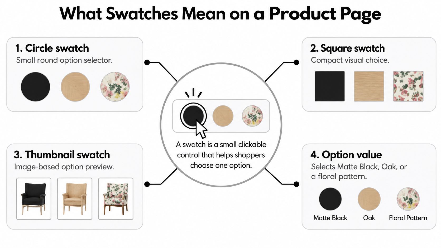
A product swatch is a small clickable control, usually a circle, square, or thumbnail, that selects an option value such as Matte Black, Oak, or a floral print. When that choice resolves to a sellable variant, the page should display its matching photo, price, and availability.
Think of a tailor's fabric scrap. The scrap isn't the suit, but it helps you choose the suit. An online swatch serves a similar purpose, except the store must also connect your choice to the item it can ship.
Say you're buying a dining chair. You tap Oak while keeping the upholstered seat you already selected. You expect to see the oak chair with that seat, not a generic wooden chair or an unrelated gallery image.
The familiar forms
Merchants usually present these choices in recognizable ways:
- Solid color chips preview a flat hue, such as navy on a simple phone case.
- Image swatches show oak grain, a floral repeat, or a lipstick smear.
- Text buttons communicate differences that color can't explain, such as Size or Recycled.
The shape isn't the defining feature. A square and a circle can perform the same job. What matters is whether the shopper understands the option and whether selecting it produces the expected result.
Physical samples and the watch brand are different
The word also describes physical fabric samples. In textile production, laboratories measure reference swatches using a spectrophotometer and record CIE Lab* values for lightness and color position, as described in the Journal of Imaging's textile color research. Those measurements help suppliers reproduce a target shade rather than approve it by eye alone.
There's also Swatch, the Swiss watch brand launched in 1983 during the quartz crisis, according to Esquire's history of Swatch. That's a brand name, not the store control discussed here.
A product-page chip previews a choice. It doesn't guarantee a screen-perfect physical match.
Nor is it automatically a collection filter. A filter narrows a group of products; a product-page swatch helps determine which version of an item enters the cart. That choice needs to be clear before Add to cart, not corrected afterward.
Color Material and Image Swatches Side by Side
Which swatch type fits the variant
| Swatch type | Best for | Shopify source | Strength | Weakness |
|---|---|---|---|---|
| Solid color chip | Flat hue such as navy or matte black | Hex or color category metafield | Light and quick to scan | Hides texture and fails color-only use |
| Image thumbnail | Pattern, grain, finish, or real product | Image tied to the option value | Closest preview of the item | Heavier files and easy photo mismatch |
| Text or button option | Size, scent, or a named material | Standard variant option value | Readable without relying on color | Less visual in a color-led catalog |
| Color plus material | Separate attributes on one product | Separate options or a combined listing | Precise variant selection | Clutter if every combination is drawn |
A solid chip is economical, but that economy removes information. It's a sensible choice for a plain cotton tee when the difference really is hue. It's a poor choice when a shopper needs to distinguish brushed metal from polished metal.
Use a deliberate color value rather than guessing from a product name. Navy can describe different shades across suppliers, so someone needs to approve what the chip represents. Keep the human-readable name beside the choice rather than making shoppers infer it from the fill.
When the surface matters
An image thumbnail carries more detail, but it needs careful cropping and consistent photography. A tiny marble image can look like random gray noise if the crop misses the veining. A velvet thumbnail can look flat if the lighting hides its pile.
Choose a crop that answers the buying question. For a patterned shirt, show enough of the repeat to identify the pattern. For a metallic finish, preserve the highlight that communicates the finish without making the thumbnail look like a different color.
The trade-off is asset management. Image swatches require files that stay aligned with the product photography, and oversized files add unnecessary download weight. Don't use an old supplier thumbnail beside a newly photographed product without checking that they still represent the same item.
When words are more useful
Text buttons are less visual, but they're often clearer. A shopper can understand Unscented, Linen, or Wide without interpreting a picture. Size should generally remain text rather than becoming a row of decorative chips.
For a product that varies by color and material, keep the attributes separate when shoppers choose them independently. A cushion might offer a color selection followed by a fabric selection. A combined listing may suit a catalog organized around distinct products, but it shouldn't imply that every pictured pairing exists.
Use these setup rules to prevent a crowded selector:
- Choose a primary format per option. Don't alternate unexplained circles, thumbnails, and abbreviations within the same row.
- Keep names visible. A selected value should remain understandable after the shopper scrolls away from the gallery.
- Exclude impossible pairings. Don't invite shoppers to select a fabric-color combination the catalog doesn't sell.
If a shopper can't name the option without seeing the chip, the row needs better labeling.
How Shopify Links a Swatch to a Variant
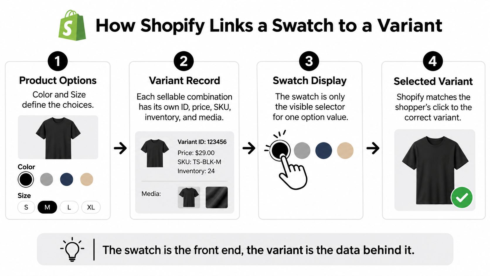
Start with the product options, such as Color and Size. A sellable combination corresponds to a variant record with an identifier, SKU, price, inventory information, and associated media. The swatch is only the visible selector for an option value.
Shopify's product taxonomy guidance explains how standardized attributes can power product options and how native swatch rendering relies on correctly configured attributes and compatible themes. Assigning a color name alone doesn't guarantee that the published theme will render a useful chip.
Follow the selection through the store
Suppose a shopper has selected Medium and then taps Navy. The theme needs to resolve Navy plus Medium, not Navy in isolation. It should select the corresponding variant identifier and refresh the relevant gallery, price, and purchase state.
A compatible theme can render a native color swatch from configured color data or an image. A theme without that support may require an app or custom theme work. Check the published theme's capabilities rather than assuming every Shopify storefront behaves identically.
Unavailable combinations need explicit handling. A store may disable the purchase action or let a shopper inspect a sold-out variant, but it shouldn't switch to another size and leave the shopper believing the original choice remains selected.
Duplicate names create a different problem. If separate values both appear as Blue, staff may attach the wrong image or shoppers may not understand the distinction. Patterned products reduced to a hex value and translated labels disconnected from their underlying values cause similar mismatches.
Data Links Behind One Swatch Click
| Data point | Where it lives | Failure if broken |
|---|---|---|
| Option value (Navy) | Color option name and value | Duplicate Blue values can lead to the wrong photo |
| Variant ID and SKU | Variant record for each color and size pair | The selected chip resolves to the wrong or unavailable pair |
| Variant image | Media attached to the variant | Gallery shows a different batch or pattern |
| Inventory quantity | Stock count per variant | Sold out appears only at cart |
| Accessible label | Text name and screen reader output | Swatch is announced as nothing or as the wrong color |
Audit a real product
Use this checklist before expanding the setup:
- Option name and value: Confirm the displayed choice matches the catalog attribute.
- Variant identifier and SKU: Add the selection to cart and compare the resulting item with the intended record.
- Image: Inspect the gallery after changing options in different orders.
- Inventory: Test a sold-out combination, including the store's configured backorder behavior.
- Accessible label: Check what assistive technology announces, including the selected state.
Standardized attributes also help keep product-page choices and collection filters aligned. Preserve the underlying meaning when translating labels, rather than creating unrelated color values for each language.
Fewer accurate chips beat a broad palette the warehouse can't fulfill. Extend the audit to collection cards, mobile layouts, cart lines, and fulfillment records before treating the setup as finished.
When Swatches Fail Shoppers and Color Checks
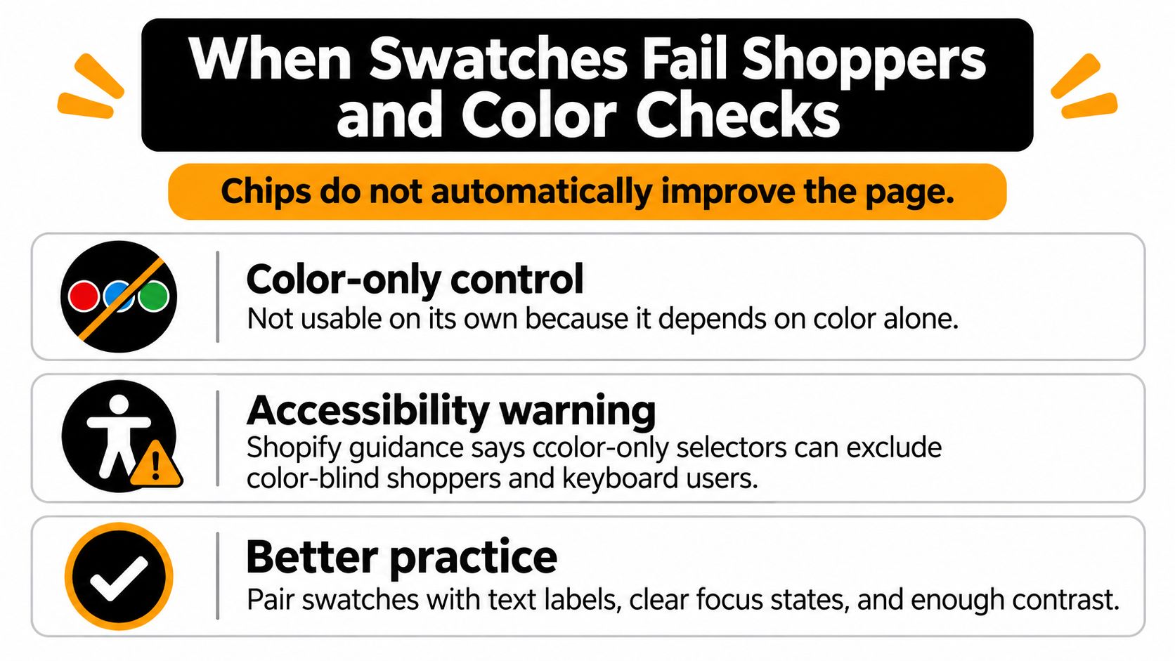
More swatches can add barriers. A row of pale circles may look tidy while giving a color-blind shopper no reliable way to distinguish the options. A clickable-looking control that can't receive keyboard focus creates another dead end.
Shopify's product-page accessibility guidance warns against color-only selectors and recommends text alternatives, clear labels, tooltips, and visible keyboard-focus states. A tooltip can support a control, but don't make hovering the only way to discover its meaning.
Make the control understandable
Give the option a visible name such as Forest Green and an accessible name that agrees with it. Show selection with more than a change in hue, and make keyboard focus distinct from the selected state.
- Name the choice: Use the merchant's actual product shade or material name.
- Expose the state: Communicate selected and unavailable options through text or programmatic state as appropriate.
- Preserve visibility: Give pale chips a discernible boundary against the page background.
- Support keyboard use: Test the complete journey through selection and Add to cart.
Separate usability from color accuracy
A perfectly labeled control can still overpromise the physical color. Substrate, gloss, illumination, and screens influence appearance. Metamerism describes samples that match under one light but differ under another; Pantone's textile color workflow uses controlled illumination, including D65 daylight, and reflectance measurement to manage color evaluation.
A hex preview can't reproduce those production conditions. Use actual-material imagery when texture or finish affects the choice, and reserve a solid chip for browsing a relatively straightforward hue. For shade-sensitive purchases, explain screen and batch limitations and offer a physical sample when the business provides one.
Hair extensions illustrate why a shade name alone isn't enough. Conde Professional's hair extension color matching guide is a relevant companion resource when shoppers need matching guidance beyond a small on-screen selector.
Put essential qualifications near the choice, not only in a distant policy page. A practical approach to writing product descriptions helps turn vague color language into useful information about finish, undertone, and material.
Avoid assuming that evocative shade names communicate the same meaning across markets. Keep the product's name consistent, then add plain descriptive language where it helps.
The final test is practical: can someone select the variant with a keyboard, understand it without identifying the hue, and avoid expecting a lab-perfect match?
UX and SEO Effects Worth Planning For
A wrapped palette can hide the selected name, leave the gallery on the old image, and still look “finished” on a desktop screenshot. That is the risk to plan for: a swatch is a merchandising-data control, so extra chips make the page worse when labels, stock, images, and accessible names disagree.
On mobile, judge the physical layout on an actual narrow screen. Long rows that wrap repeatedly can push purchasing controls below supporting content, and a hidden overflow menu can save space while also concealing the current selection. Keep the chosen option named beside the control, and make the unavailable state change before the shopper reaches the button.
Collection cards have less room than product pages. Show a useful preview of available choices without burying the title, price, or product image, and make a card-level swatch lead toward the same selection shoppers will meet on the destination page.
Treat a swatch change as one variable inside Shopify conversion rate optimization. Compare behavior across relevant devices and products, and account for other merchandising changes during the same period.
Useful checks include:
- Purchase progress: Track add-to-cart behavior and whether shoppers repeatedly reverse option selections.
- Selection errors: Review wrong-item contacts and returns attributed to color, material, or size confusion.
- Interface reliability: Watch for clipped labels, delayed images, and selection states that disappear after navigation.
Extra taps can mean inspection or uncertainty. A shopper tapping back and forth may be comparing finishes, or trying to work out which choice the page has accepted.
Don't treat each chip as a search landing page
A swatch graphic works like a switch for variant data. It still needs readable product information around it: meaningful option names, descriptive image alt text where appropriate, and visible copy that explains distinctions a shopper might search for.
A variant query in a URL does not, by itself, establish a separate search opportunity. Inspect the store's canonical configuration and indexing behavior before assuming each color selection deserves an independently optimized page, and avoid building a ranking strategy around extra parameter URLs.
Create a separate landing page because the product and search intent justify it, not because a selector can produce another URL.
Keep color and material terminology consistent across options, descriptions, and filters. If Navy and Dark Blue describe the same catalog value, resolve that naming decision before producing more content.
For broader editorial work, teams looking to generate AI listicles for DTC brands can consider Landra as a content-production tool. That task remains separate from maintaining accurate variant data; a buying guide can explain choices, but it cannot repair a selector linked to the wrong item.
Swatches in Fashion Home and Beauty Stores
A shopper choosing a basic tee needs a different preview from someone matching lipstick. Treat these as catalog decisions, not opportunities to apply the same attractive selector everywhere. Each chip is a promise that a name, a photo, and a stocked variant agree, and every extra chip makes the page worse the moment those three disagree.
Apparel and home furnishings
A basic tee needs solid chips with text sizing. Keep size as a text label, and make the availability of the selected color-size combination clear. The mistake to avoid is leaving a previously chosen size looking purchasable after the shopper switches to a color that does not offer it.
A sofa needs a different treatment. Linen, velvet, and a patterned weave may share a beige appearance while feeling and reflecting light differently. Use image swatches photographed from the corresponding upholstery, not identical beige chips with different names.
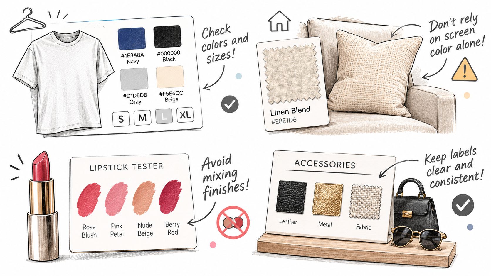
Keep the selected fabric name near the gallery so the shopper can compare it with the specification. Don't crop a patterned weave so tightly that the thumbnail hides the pattern shoppers are paying for.
Beauty and shade-sensitive surfaces
For lipstick, use an appropriate product close-up or a smear image that communicates finish and pigmentation. Keep the shade name visible, especially when neighboring reds are difficult to distinguish. If you show application on skin, provide enough context that shoppers don't mistake a particular result for a universal one.
Paint or wall panels can use chips for initial browsing, but the final choice may warrant a physical sample when the merchant sells one. Don't imply that the screen preview is a substitute for seeing the surface in the room where it will be installed.
Checks worth running per category
- Patterned materials: Tap every chip and confirm the gallery swaps to that exact fabric photo, not a flat-color sibling from the same range.
- Shade ranges: Compare neighboring shades on a phone screen and confirm each name stays readable next to its chip, because two similar "berry" labels make a working selector look broken.
- Physical-sample categories: Where a sample exists, confirm the page explains or links to it, rather than leaving the screen preview to carry the final decision alone.
Start with your own bestseller. Is the buying decision primarily about flat color, textured material, or a shade-critical finish? Classify it before choosing a swatch tool.
Pick Theme Swatches an App or Custom Code
Ways to add swatches on Shopify
| Route | Best when | What you control | Trade-off |
|---|---|---|---|
| Native theme swatches | Theme already supports color swatches | Hex and images in Shopify admin | Look limited to the theme |
| Swatch app | Theme lacks swatches or cards need chips quickly | App settings and display | Cost plus possible theme conflicts |
| Custom theme code | Brand needs specific layout or keyboard behavior | Section markup and labels | Developer time and upgrade care |
| Custom app | Rules must run in admin or across stores | Option data and store logic | Build and ongoing maintenance |
Choose native theme swatches when the existing theme handles the catalog's ordinary colors and image choices correctly. Accepting the theme's styling limits is often simpler than introducing another dependency.
A swatch app makes sense when the theme lacks the required display or collection cards need matching controls. Include ongoing app costs and compatibility testing in the decision. This guide to apps for Shopify can help frame app selection around the store's actual requirements.
Separate display work from data work
Use custom theme code for storefront behavior that existing controls can't provide. Choose a custom app when the requirement involves admin automation, integrations, or shared option rules across stores. Don't commission an app solely to change a border style.
Image preparation is a separate job. PROMPTit AI Bulk Images Editor for Shopify provides product-photo tools including upscaling, image enhancement, background processing, graphic-element removal, and lifestyle-image generation. Those functions don't replace swatch-to-variant mapping, and edited images still need checking for faithful product representation.
Acceptance test: Stage the change on a real product with an unavailable color-size combination before applying it across the catalog.
Test the photo, price, stock message, cart item, and accessible name together. The route is suitable only when the full selection works, not merely when the chips appear.
We build custom Shopify apps for integrations, admin automation, and features that existing App Store apps don't offer. If your swatches need option-data synchronization or custom selection logic, visit Yassine Malti and share a representative product, the mismatch you need to fix, and the systems involved.
Shopify apps by Yassine Malti
Put this into practice
-

PROMPTit · AI photo editing
Five AI image tools for your product photos · 5 images/month free
-

ALT SEO · Image alt text
AI alt text for every product image · 100 images/month free
-

RANKit · Meta titles & descriptions
AI meta titles and descriptions, sized for Google · 50 meta tags/month free